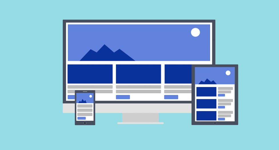
As the world becomes increasingly mobile, it’s more important than ever for businesses to have a mobile responsive website. Mobile responsive websites provide an optimal viewing experience for users, no matter what device they’re using. They’re easy to navigate, and they load quickly. Most importantly, mobile responsive websites are essential for businesses that want to remain competitive. If your website isn’t mobile responsive, you risk losing potential customers to your competitors. Mobile responsive websites are the future of the internet, and your business needs to be on board.
Use a responsive design so your website automatically scales to fit the screen size of the device.

Responsive design is an approach to web design that makes your website work on all screen sizes. It is a way of thinking about design that starts with the user and their device, rather than the size of the screen.
The goal of responsive design is to create a website that provides a good experience for the user, no matter what device they are using. responsive design is about using HTML and CSS to automatically resize, hide, shrink, or enlarge, a website, to make it look good on any screen size.
Here are a Few Tips and Tools for creating your mobile responsive site!:
Media Queries:
Media queries are a CSS3 feature that allows you to specify different styles for different screen sizes. For example, you can have one set of styles for screens that are 400px wide or less, and another set of styles for screens that are 401px wide or more. You can use media queries to create responsive designs that adjust automatically to different screen sizes.
Fluid Layouts:
Fluid layouts are a way of creating layouts that automatically adjust to the size of the screen. They are created by using percentage-based widths instead of fixed widths. Fixed width layouts are created by using pixels or ems.
For example, if you want to create a fixed width layout that is 1000px wide, you would use the following CSS:.container { width: 1000px;}
Fluid layouts, on the other hand, are created by using percentages. For example, if you want to create a fluid layout that is 100%width, you would use the following CSS: .container {width: 100%;}
The main advantage of using fluid layouts is that they automatically adjust to the size of the screen. This is important when you consider that the screen size of devices can vary greatly, from small smartphones to large desktop monitors.
Flexible Images and Media:

Flexible images and media are another way of making your website automatically resize to the size of the screen.
The main difference between flexible images and media is that flexible images are resized by the browser, while media is downloaded in different file sizes depending on the user’s connection speed and the size of their screen.
To make an image flexible, you need to use the max-width property. The max-width property is used to specify the maximum width of an element. You can also use the max-width property for videos, iframes, and other media. To make a video flexible, you need to use the max-width property and the aspect ratio. The aspect ratio is the width-to-height ratio of a video.
Use Responsive web Typography
In the world of web design, responsive typography is a term that is being thrown around a lot these days. And for good reason! With the ever-growing popularity of mobile devices, it is more important than ever for websites to be responsive and adapt to different screen sizes.
One of the most important aspects of responsive design is typography. After all, what’s the point of having a beautiful website if the text is unreadable on mobile devices? There are a few things to keep in mind when it comes to responsive typography. First, you need to make sure that your fonts are legible on all devices. This means choosing fonts that are easy to read on both small and large screens.
Second, you need to pay attention to the hierarchy of your fonts. This means using different font sizes and weights to make sure that the most important information is always easy to find.
lastly, you need to make sure that your line lengths are comfortable to read. On smaller screens, long lines of text can be difficult to read, so it’s important to keep your lines shorter. By keeping these things in mind, you can create a responsive website that looks great and is easy to read on
Keep your Design Simple!
When you are creating a mobile responsive website, it is important to keep your design simple and uncluttered. This will help to ensure that your website is easy to navigate and that users will be able to find the information they are looking for quickly and easily.
A simple and uncluttered design will also help to make your website load faster, which is important for users who are accessing your site from a mobile device.
So, if you want to create a mobile responsive website, be sure to keep your design simple and uncluttered. This will help to ensure that your website is easy to use and that users will be able to find the information they need quickly and easily.


